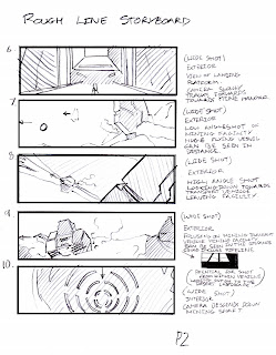
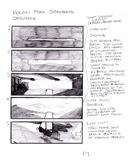
Below are all my own storyboards. These images show the progression of the initial idea for the animated mining environment sequence. Rather than having a fly through, I decided to have various different shots, either static shots or slight pans of the environment. Pretty much all these shots are wide shots so that vast scales are emphasised and all the components can be seen clearly and are not obscured. The wide shots will look very nice with widescreen format thus producing an aesthetic cinematic format.
Rough Line Storyboards

 Rough Shaded Storyboards
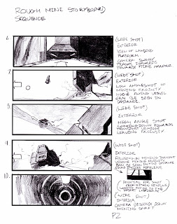
Refined Digital Storyboards (Greyscale)
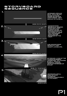
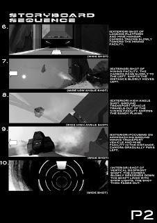
Refined Digital Storyboards (Colour)
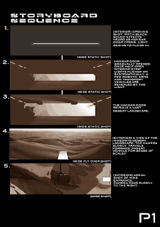
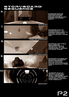 I was not sure about the ending above. It seemed weak and lacked enough emphasis of a journey or narrative within the boards. Thus I spoke to the group and consulted with Jared to acquire their opinions and advice. As a group we decided that there should be a narrative depicting a journey of the mining vehicle towards its destination which would be the aperture mining entrance leading to a secondary excavation. Below is the revised board which show a shot of the mining vehicle interior looking out on to the vast expanse of a sandy desert. The next two shots depict the vehicle waiting for the aperture door in the rock face to open. The final shot is from the point of view of the vehicle moving down the dark tunnel interior rimmed with strip lights. The shot then fades to black.
Revised Board Page 2 Edit (Greyscale)

(Colour)

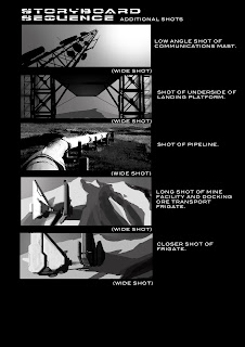
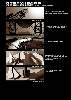
The board sheet below depicts a few ideas I had for additional shots that could be included for establishing shots. These are shots purely for showing off our modeling and lighting, depicting the scale of the environment and creating an aesthetic quality to the short film.
Additional Shots (Greyscale)
(Colour)
Establishing Shot Concept
Greyscale
The shot below basically was an idea to inform the viewer of the whole environment. I had doubts whether we were going to be able to render this scene with all the components. There was the option to render using layers of course but this would have taken time. We decided to render this scene with no 3D animation and decided to cut down on some elements. We decided to remove the oil wells and the pipeline from the shot. This was only a guideline for the desired shot, thus the final rendered shot looked radically different in terms of camera angle, distance and composition.

Colour

It was encouraging to hear from both students and tutors that my boards were very professional. I must be doing something right. I wanted the shots to be relatively simple and focus particularly on displaying our models in an artistic way by paying attention to balanced composition. The other component that will be key to our success is lighting. I have attempted to incorporate what the "Golden Hour" may look like within our environments in the boards. These shots were inspired by the cinematic experience and by photographers/ directors such as Stanley Kubrick.
What I believe I have done well in these boards is to portray the vast scale of our environment, but most importantly depicting our environment using effective camera angles and composition to present our work in an aesthetic and interesting way, which hopefully will be entertaining to the viewer as they are lost in a new world of imagination based on something quite familiar yet presented with a futuristic science fiction slant. I want our piece to be thought provoking regarding resource consumption today, but above all I want our piece to look slick and arty. Using shots such as these will undoubtedly enhance our designs and make them seem more professional. However I am a little concerned that I have been unadventurous with my camera placements. Perhaps I should have incorporated more close-ups, but I guess that close-ups could pose a new problem as bad texturing will be able to be seen.
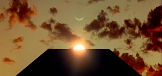
An image from 2001: A Space Odyssey
The image above and others like it were used as inspiration in order to prepare well balanced shots for our short animated mining environment.
Although at first I thought it unnecessary to produce an animatic for our animated environment, Ben explained that it would be useful in helping to see what our final short film will look like and thus will give us an idea of how to assemble the short film. He explained that we could use the animatic as a guideline so that we will be able assemble the final short film quickly and efficiently. Ben explained that he would use each cell of my original storyboard to form a simple animatic. He stated that he would concentrate on demonstrating camera movements.

No comments:
Post a Comment